This is the Police is an indie, adventure/strategy game which released August 2nd, 2016. The game follows police chief, Jack Boyd as he comes into contact with the “ugly underbelly of Freeburg,” a very New York-like city as he tries to make 500k in 180 days. The game promises the freedom to be as good a cop or as bad a cop as you want, provided you don’t get caught. I remember thinking something was up when I first became familiar with the game.
When This is the Police was released, it was just nearing one month since the slayings of Philando Castile and Alton Sterling happened and the pain was still quite raw. It felt, already, like a strange moment for a game about police corruption to be dropping but my feelings towards the title only worsened when I delved into the promotional material. As This is the Police sees yet another platform release, this time on the Switch, I think it’s a good time to discuss what the agenda of This is the Police is and the ways it communicates that.
Who is Jack Boyd?
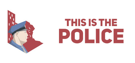
Before the player has even booted the game up, I think it’s important to look at the game’s protagonist and only playable character. After all, Jack Boyd is so important that developer Weappy Studio incorporates Boyd into the title art for the game itself. Jack Boyd is a white, cishet man and, because he appears on the title art, that’s one of the first things you know about the game. This is the Police has a very effective title art far as I’m concerned. It’s a white background with the title of the game in thick, red typeset. It’s subtle but, attention-grabbing. On the left side they have a red background and juxtaposed against that is none other than, Jack Boyd. He’s also the only thing in the title art to be colored as he would be in-game. He’s meant to stand out and, best believe, it’s a signal to the customer.
Feminist Riots

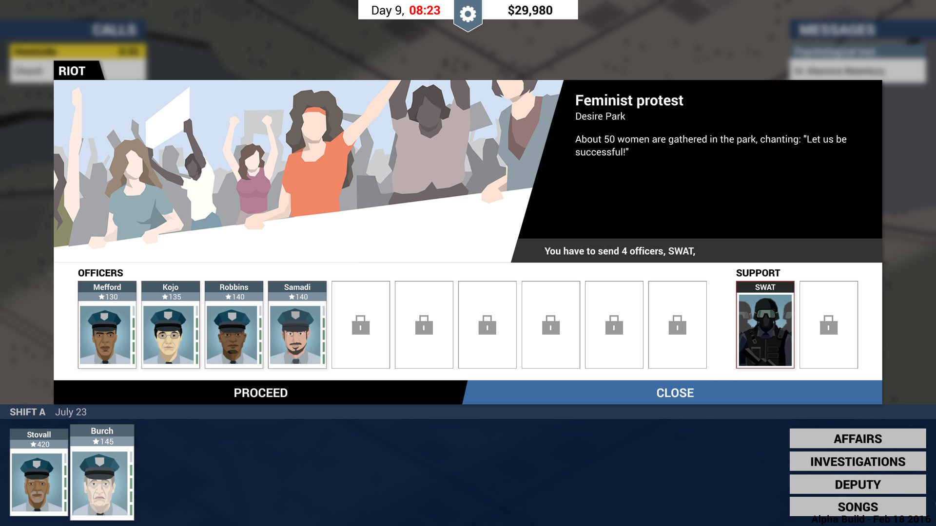
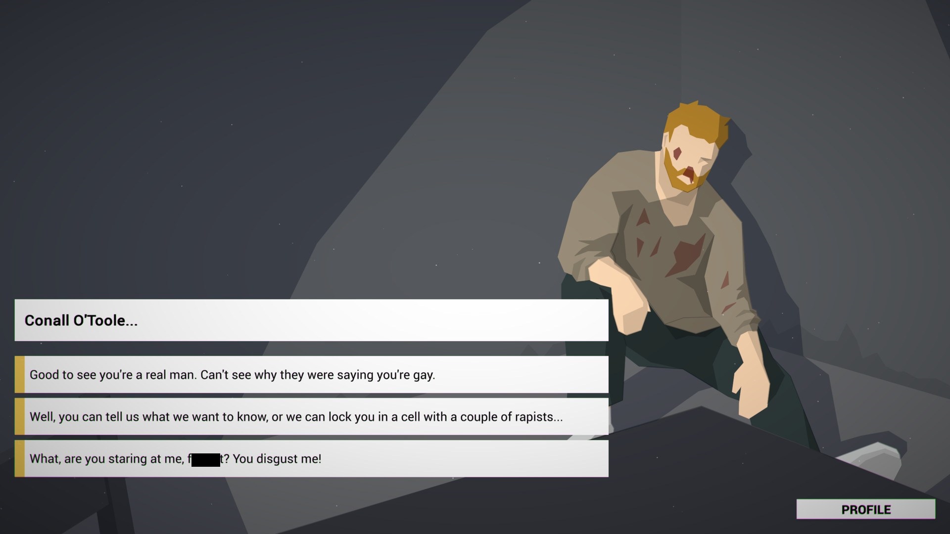
As I was looking through the press kit for this article two screenshots struck me with the force of a Mack Truck. The first is an image of a brutally beaten man sitting in the corner of an interrogation room. The second is a screenshot describing one of the scenes players are tasked with responding to. It’s a “Feminist Protest” and it was given the Riot category despite being described as, “50 women gathered in the park, chanting: Let us be Successful.”
The most significant thing to me in looking at these two screenshots comes in the first. As you stare at this man bleeding on the floor, you are given three options of what to say to him. The first says that the subject seems like a “real man” and therefore isn’t gay. The second option is to threaten to have him raped. The third is to call the guy the f-slur. The fact that the folks doing the marketing for this game saw this particular screenshot as a draw for the game says it all. This is the Police is trying to signal to white, pro-cop customers that this is a safe game for them.
I recognize the argument can be made that Weappy Studio could have intended This is the Police as a way to shine the light on the ugliness of policing. But, I don’t believe that even the intention was there, it’s not detectable in the marketing. Instead, the marketing spends time making sure the consumers know that you can play out a violent power fantasy from the position of a white officer. The marketing revels in the game’s potential to diminish marginalized groups and enact violence towards them. If there was a way for Boyd to take a firm stance against this injustice, the marketing team didn’t feel it was important enough to promote.
Latest posts by Nicole Hunter (see all)
- When the FPS for “Everyone” Goes Pro - January 16, 2018
- Can You Enjoy Problematic Games and Uphold Your Values? - December 5, 2017
- Why Video Game Criticism Exists - November 9, 2017
