
On Tuesday, August 21st, indie game developer melessthanthree released their new title, Lucah: Born of a Dream. A Kickstarter funded action-adventure game that combines the powerful aspects of storytelling, role-playing, and survival-horror, Lucah tells the story of the Marked Child, cursed to have their personal demons manifest as real demons wherever they go. Lucah must face these demons within the terrifying realm of their own nightmares in order to achieve Purification.
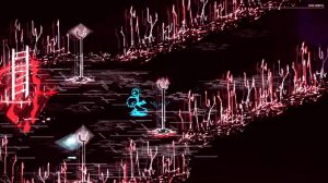
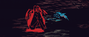
The game boasts an art style that evokes the thematic elements—self-discovery, guilt, inner demons, self-acceptance, growth—flawlessly. With significant contrast between dark and light, bright neons, and aggressive line work, the game elicits feelings of anxiety, tension, anger, and danger at every turn.
The creator of the Lucah, Colin aka melessthanthree, was kind enough to discuss the art style, its purpose, and what it meant to them in more detail.
New Normative: There is a noticeable use of light and dark in the game environment. What were your goals in creating such distinctly dark settings?
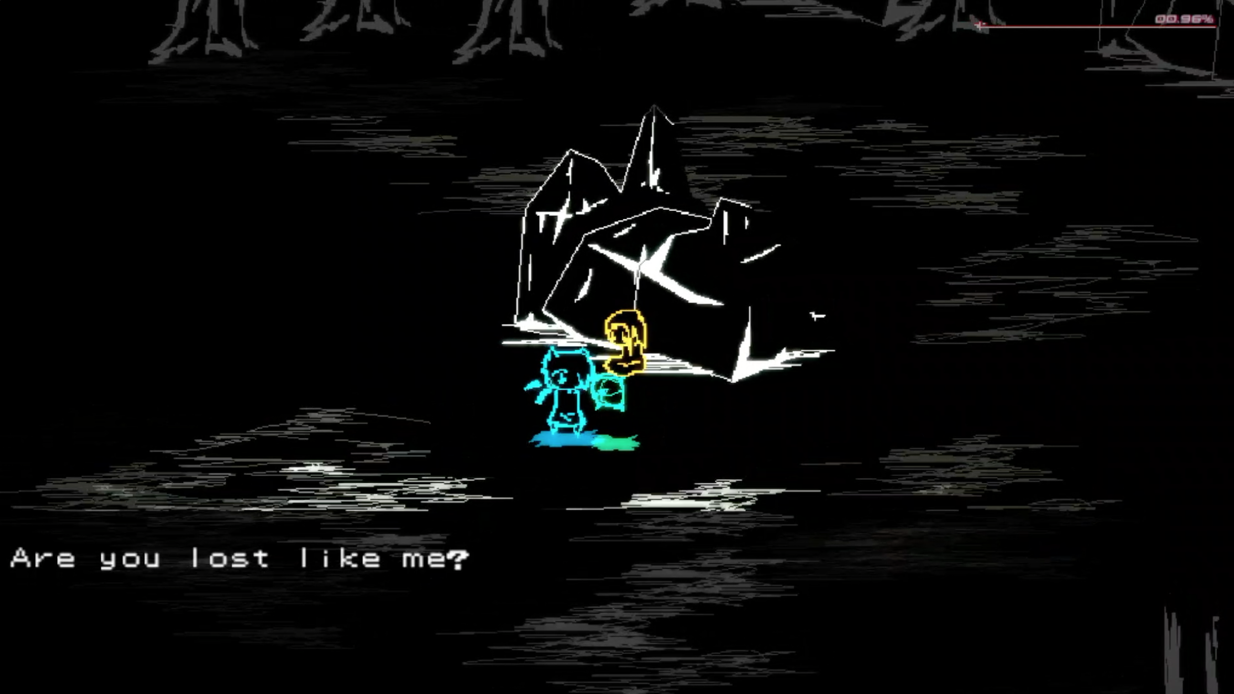
Colin, melessthanthree: One of the early inspirations for Lucah’s art direction was the feeling of night terrors, being trapped in one’s head and alone in the darkness. I also tend to enjoy dark environments and high-contrast colors in art, so I think those factors helped me realize the unique direction the game’s visuals went in. It helped me form this story about pushing through a world that only seems to want to hurt you, which was the sort of story I’ve been wanting to tell for a long time now, and I was happy to finally get to bring it to life through my own personal style.
Did you always plan to use specific color schemes during development?
There were some ideas I had coming into the game in regards to art direction, but it mostly evolved organically as I started to figure out the game! The game’s color choice mostly just started from personal preference—the black background [and] contrast-focused style came about because I normally prototype my ideas with a black canvas and simple, sketchy sprites evocative of hand-drawn line work.
I liked the starting blue of the main character as a “player character color” because it stood out from everything else and was pleasing to the eye. The red of the nightmare enemies then made a nice contrast while also quickly demonstrating the idea of danger and pain.
Finally, while putting together the game’s environments, I learned to use shades of white and grey for most of the background [and] environmental objects, as they provided a nice border and grounding to everything, while not drawing too much from more important elements, like items and enemies during combat encounters.
In terms of color schemes—red, white, and black seem to be the most used colors, with bursts of neons in certain places. Are these colors and colors schemes meant to incite emotional reactions in the player?
The colors, along with the line work of the sprites, are meant to convey anxiety, motion, violence—all sorts of ideas that don’t work too well when trying to convey literally, but are powerful when suggested.
Most of Lucah’s art is evocative more than representative, and this worked to our advantage in many ways, including making the game possible to produce in the first place! More importantly, it allows us to leave more of the game open to interpretation and personal experience, which goes along nicely with the game’s thematic elements.
As for the art itself; the style is “messy,” so to speak, with a lot of line work. Is this meant to portray how people might see the world through nightmares?
There’s certainly an element of that, though I think it’d be more specific to say it portrays how I see the world through nightmares or during a particularly bad bout of anxiety and depression. Things are often hazy and suggest an ever-present, abstract danger, the feeling that something is wrong, but you don’t know what.
However, I intentionally pair that with most of the main character designs, represented in the game with smaller, “chibi-influenced sprites, with big heads and kind eyes. My hope is that these characters can represent a light in the darkness, and hinting at a way through the haze, which is something the game’s narrative pushes for.
It can appear as though the world in the game is sort of like what it’s like living with certain mental illnesses or experiences of dissociation. Was this part of your goal in development, or did you have a different purpose for the art style in mind?
I wouldn’t say it was my goal from the start, but that’s certainly a good description of what it became. Like many things in Lucah, the art style evolved and grew along with the other aspects of the game, like its design and sound, each element influencing the direction and decisions of the rest.
When creating the first set of animation and backgrounds for the game, I felt its potential to express the feeling of isolation and anxiety that comes with mental illness and dissociation, and chose to lean into it.
Thanks to Colin for taking the time to discuss Lucah’s unique art. To learn more about the game head over to its official Tumblr.
Latest posts by Julia Brackett (see all)
- How the Evolution of Witches Affects Gaming - October 10, 2018
- Art as an Evocative Tool: A Talk with Lucah Developer melessthanthree - August 27, 2018
- Fat-Shaming in Villain Design - August 20, 2018